


Data view
Introduction
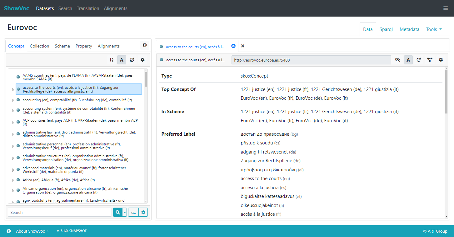
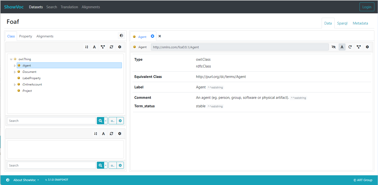
The Data view page is accessed after clicking on a dataset name in the Datasets page. The Data page is composed of two main areas: the structure on the left, and the resource view on the right.
The Data Structure View
The left section of the data view page is dedicated to the data structures. This is a panel containing tabs with tree or list structures. The available tabs, that might differ according the data model adopted in the dataset (RDFS, OWL, SKOS or Ontolex), are:
- Class: contains a panel showing the rdfs and owl:Classes of the dataset hierarchically structured (available only in RDFS and OWL datasets).
- Concept: contains a panel showing the skos:Concepts of the dataset (hierarchically structured or as a plain list, based on the selected visualization mode), eventually filtered according the selected active schemes (available in SKOS and Ontolex datasets).
- Collection: contains a panel with the skos:Collections of the dataset (available only in SKOS datasets).
- Scheme: contains a panel with the skos:ConceptSchemes of the dataset (available in SKOS and Ontolex datasets).
- Property: contains a panel with the properties tree.
- Lexicon: contains a panel with the list of the lime:Lexicons (available only in Ontolex datasets).
- LexEntry: contains a panel with the ontolex:LexicalEntry in the active lexicon (available only in Ontolex datasets).
- Alignments: this is a "special" tab. It contains a list of alignmed datasets with the current one. Further details can be found in the dedicated page.
At the bottom of every structure panel (so, except for Alignments) there is a search bar that will be described later.
All structure areas in the Data View have some buttons in common (upper-right part).
The Sort Button  changes the sorting of the resources: available sorting criteria are by URI or by Rendering.
The Rendering Button  activates the rendering for the resources shown in the structure.
The Refresh Button  allows the user to refresh the view on the structure.
A further gear button  is present in the Concept and LexEntry panel and allows to edit the settings of the specific structure. Currently, the only one available is for the visualization mode of the resources.
Above these three buttons, in the same row of the tab selectors, the button  opens a language settings dialog.
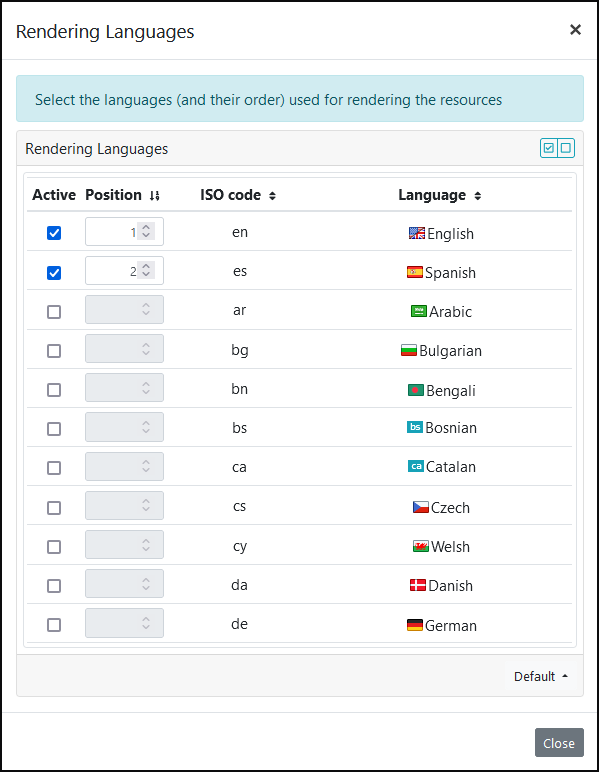
From this dialog the user can set the languages (and their order) for rendering the resources in the data structure view. The defined languages can be sorted by name, code or the rendering order ("position" column). The "active" column determines which languages have been selected for being shown. An Administrator user can provide a default languages setting for a dataset (see here). In this case, if a user doesn't activate any language, the default setting will be applied.
Rename tabs / hide tabs
It is possible to rename one or more tabs in the Data Stricuture view. Only the Administrator, or the Project Manager have this possibility.
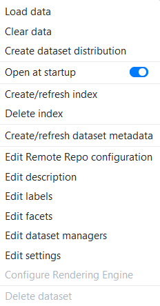
To rename one or more tabs, log in as Administrator or Project Manager and then go to "Administration Dashboard" / "Datasets". Then select any project and click on its dataset context menu (downward-pointing triangle in the last column of the Dataset list) and click on "Edit Settings" to open the project’s "Dataset settings"
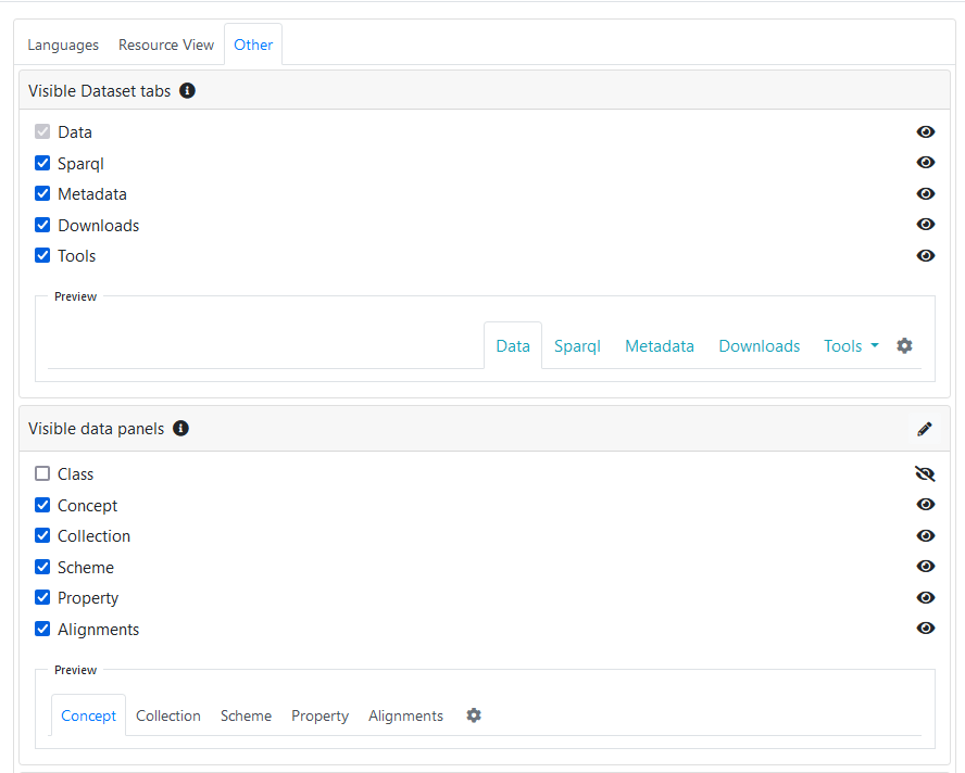
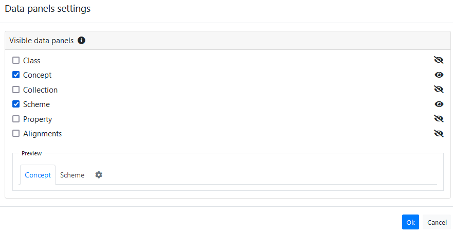
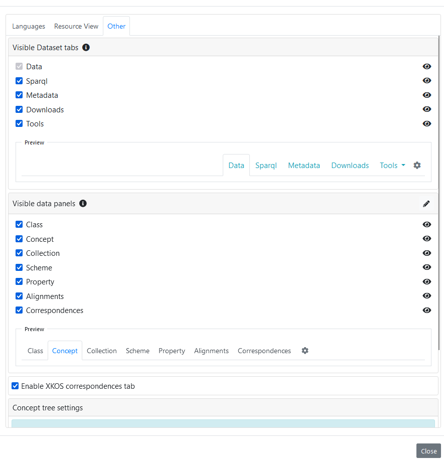
In the new window, click on the "Other" tab to see the section "Visible Data panels". Click on the pencil.
Click on the "+" button and select a language (e.g "en"). Now it is possible to set a new label for any of the existing tabs. For example, it is possible to rename the "Concept" tab into "Concept Tree".
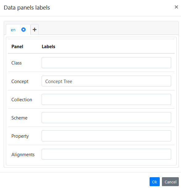
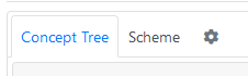
Click on "Ok" to save the change and return into the desired prject view (by clicking on the project name itself) to see the tabs (on the left side) and see that the changed one has the new name (in this example it went from "Concept" to "Concept Tree")
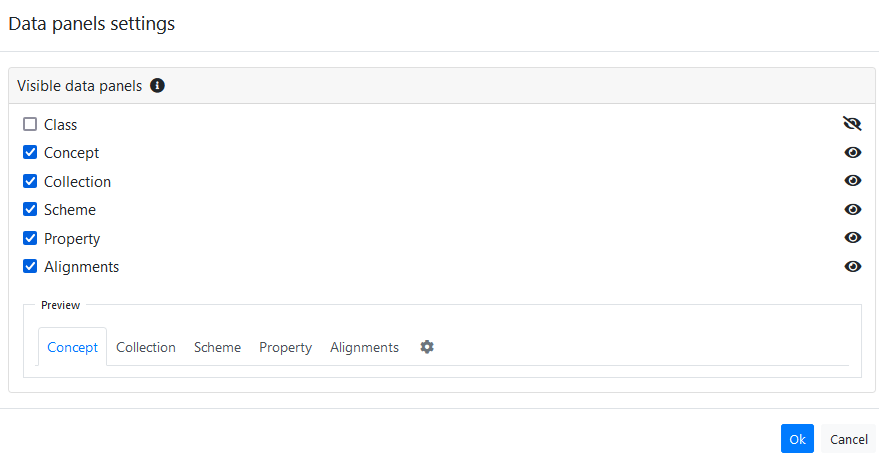
It is also possible to hide one or more tabs. This can be done in two different way:
- The Administrator, or the Project manager, can decide the default behaviour for which tabs should be visible or should be hidden (they can do in a similar way as it was done when changing the name of a tabs, by checking/unchecking the elements in the "Other" tab of the "Dataset settings").
- Each user can decide which tabs to see and which should be hidden (and they can override, for their browser, the default behaviour decided by the Administrator/Project Manager)
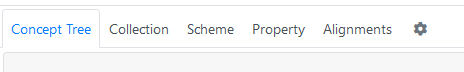
Then these are the visible tabs:
And if the user uncheck some of the tabs:
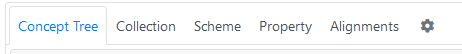
Then these is what the user will see:
KOS View
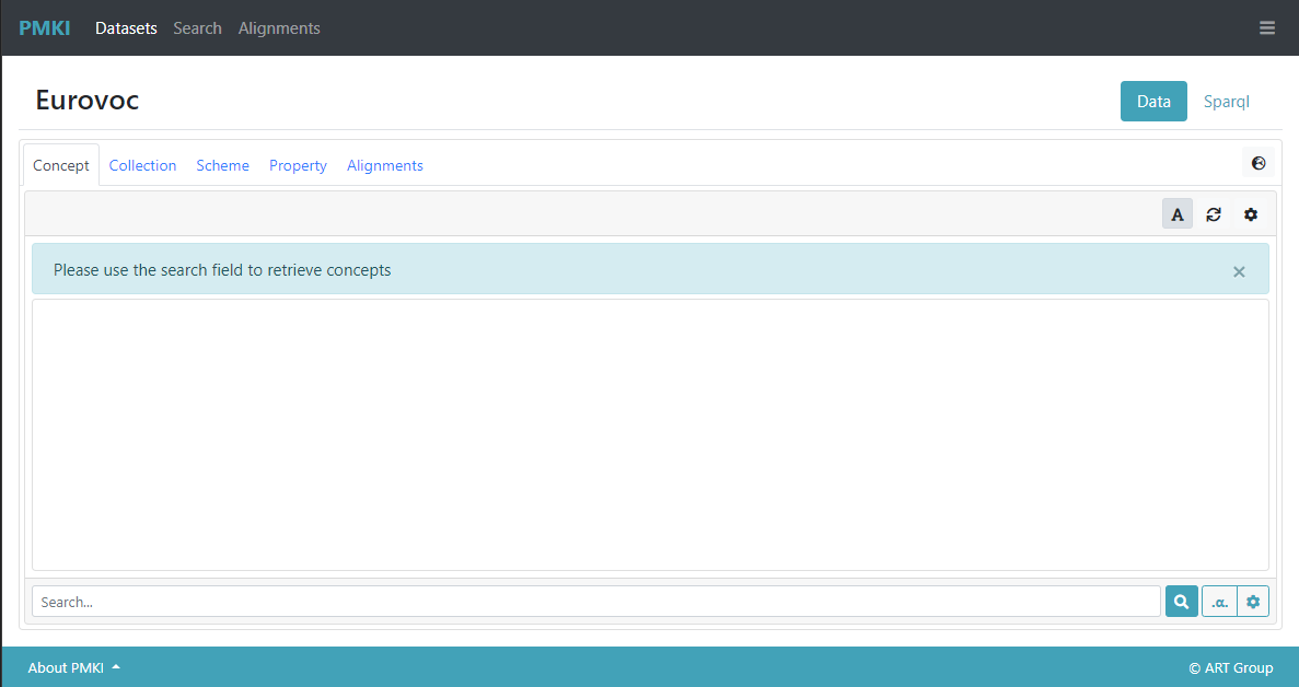
When a SKOS dataset is accessed, the main tab is the Concept one. As previously stated, it provides a hierarchical view of the skos:Concepts of the dataset (an example is already shown in the first screenshot of this page).
An alternative visualization mode can be set from the Concept tree settings modal.
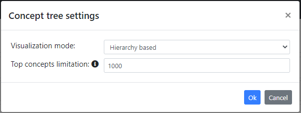
From here user can switch between Hierarchy based and Search based mode. Additionally, if Hierarchy based is chosen it is possible to set a limitation to the maximum amount of top concepts visible in the tree. This last setting is useful for preventing the initialization of a tree with too much top concepts which may cause performance issues.
Note: administrator user can restrict/force the visualization mode so that visitor users cannot change it. For example he may set the usage of the search mode and prevent visitor users from switching to hierarchical mode (see here).
When the Search based mode is activated, the Concept panel is empty (it will not show the usual concept tree) and it allows users to reach a desired concept only by using the the search function.
XKOS View
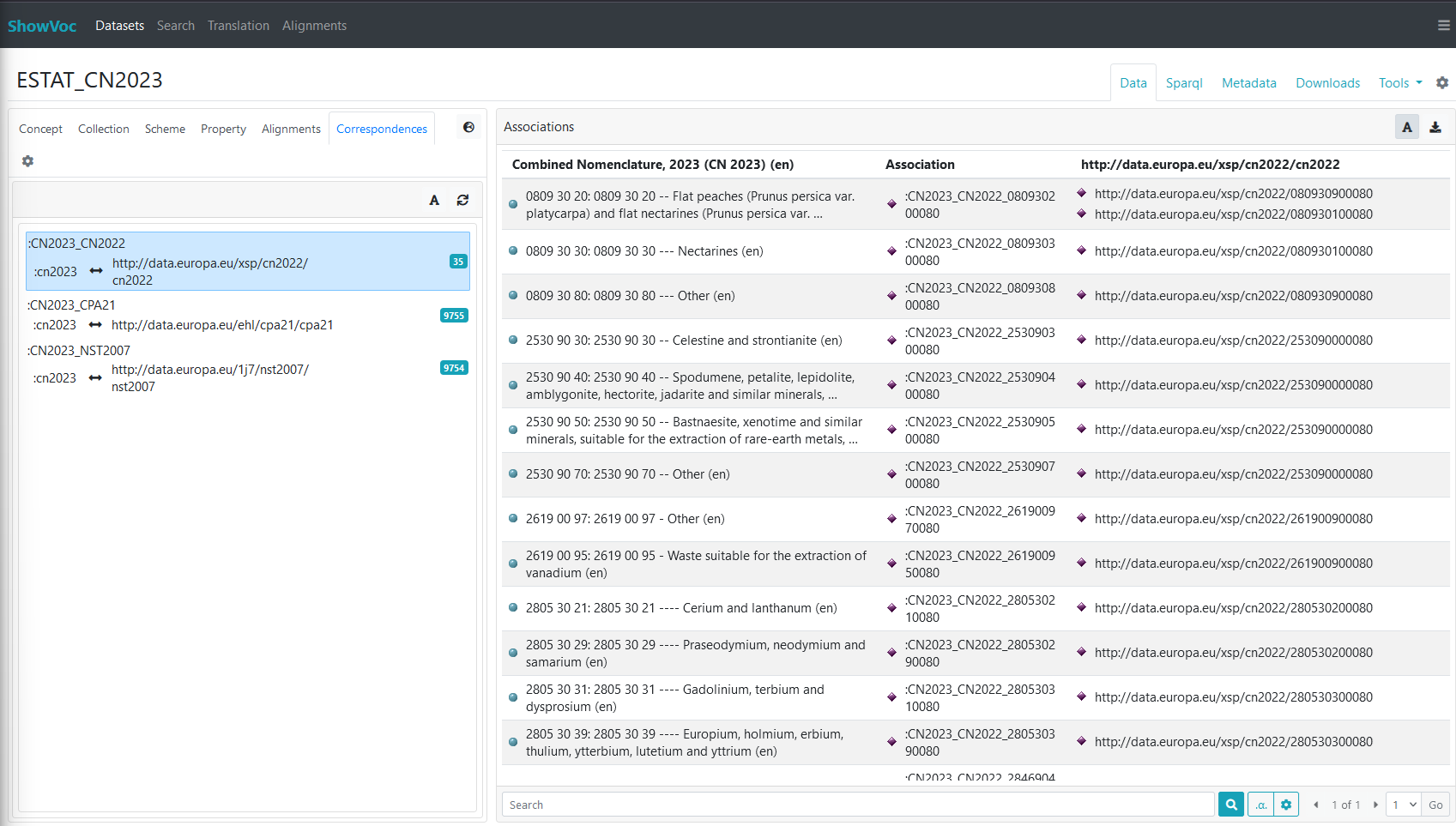
It possible to enable the XKOS correspondences tab to see, if the exist, the various xkos:Correspondence and xkos:ConceptAssociation resources (more information about the XKOS standard can be foud at XKOS and at XKOS Best Practices).
To enable such view, the Administrator, or the Project Manager, needs to go to "Administration Dashboard" / "Datasets". Then select any project and click on its dataset context menu (downward-pointing triangle in the last column of the Dataset list) and click on "Edit Settings" to open the project’s "Dataset settings". There, in the "Other" tab, after the "Visible data panels" section, there is the checkbox "Enable XKOS correspondences tab". Check it to have the new tab "Correspondendes" available.
Now, if you close this window and open the desired project, you will see that new tab "Correspondences". If you click on it you will see the various xkos:Correspondence available in that dataset, and if you click on any of them, you will see the various xkos:ConceptAssociation (each with its xkos:sourceConcept and xkos:targetConcept)
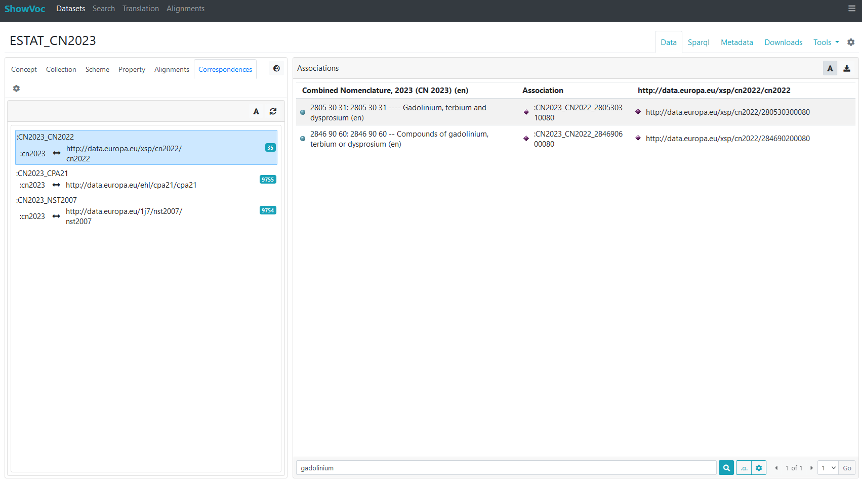
Is also possible to do searches on the associations. These searches will be carried out on the xkos:sourceConcept (their lexicalizations or their URIs, depening on the input configuration, in the same way as the searches are done, for example, in the concepts tree). So, for example, this is the results of searching for all labels containing the word "gadolinium":
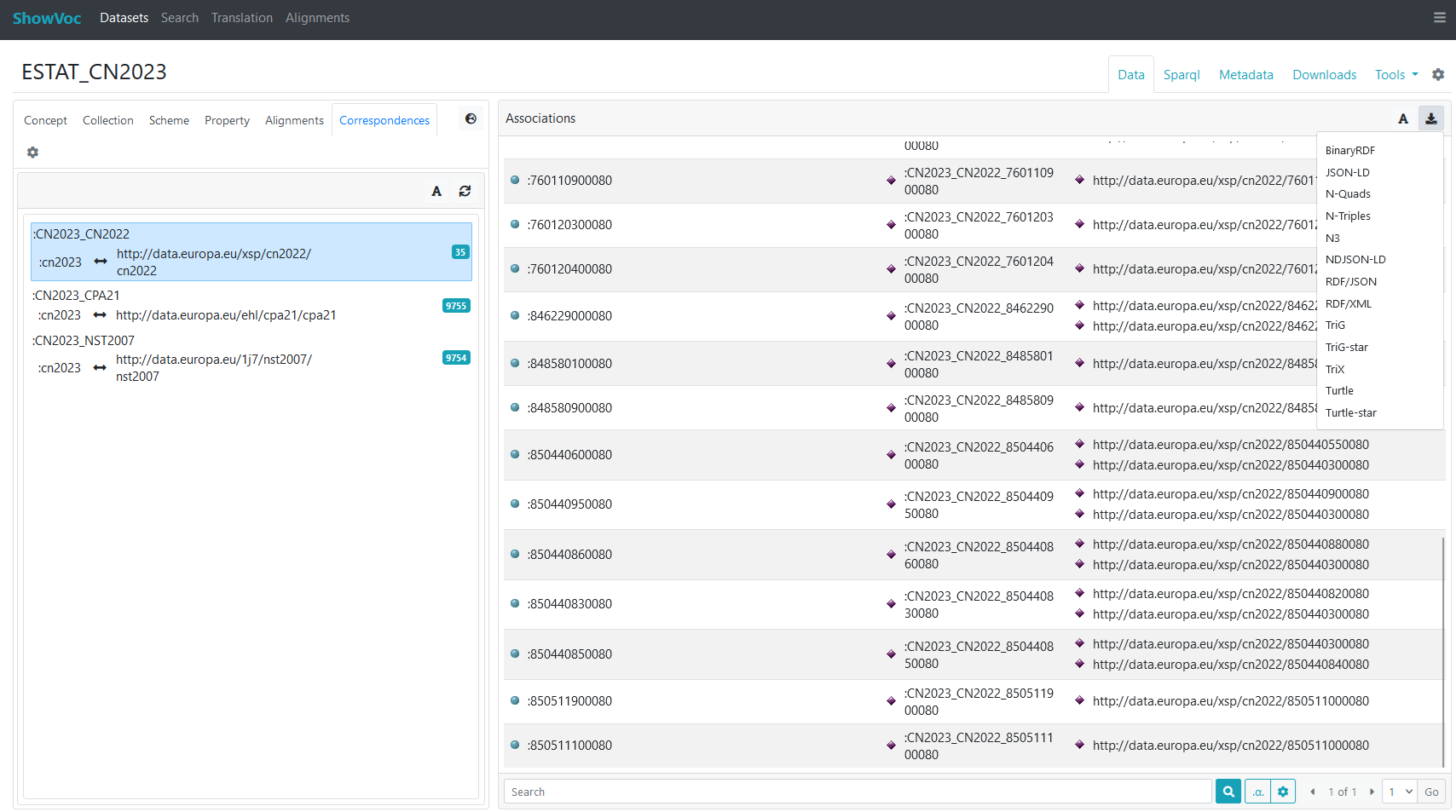
The list of xkos:ConceptAssociation (of the selected xkos:Correspondence) can be easily exported by clicking on the "export" button, in the upper right part of the "Associations" window, select the desired format and decide where to save it on the local computer.
Ontology View
ShowVoc provides also a basic view for exploring RDFS or OWL ontologies.
The Class panel is divided into two vertical sections: the top section displays the class tree, while the bottom section displays the instances of the selected class, if any.
The visualization of the class tree can be slightly customized clicking on the "gear" button on the top-right corner of the panel.
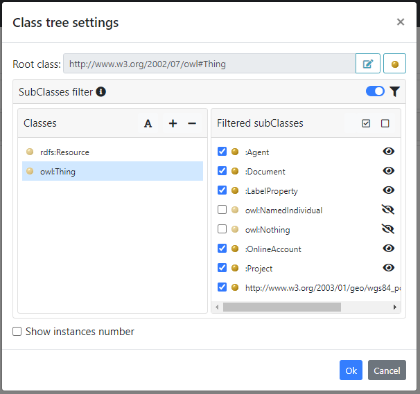
From the settings dialog users can:
- choose the root class of the tree (by default the class tree is rooted on owl:Thing).
- customize the tree by filtering some classes: it is possible to exclude a specific class from the tree. For instance by default, some imported classes like owl:NamedIndividual or owl:Nothing are hidden). In order to be effective, the filter must be enabled through the "funnel" switch.
- enable or disable the visualization of classes instance number. When enabled a numeric badge, shown next to the class name, informs the amount of instances of such class.
Lexicon View
The lexicon view is available for Ontolex projects. In this view the relevant tabs are Lexicon, which just allows the selection of a lime:Lexicon, and LexEntry which offers a list-view of ontolex:LexicalEntry, defined in such lexicon, subdivided alphabetically. A dropdown menu between the toolbar and the list allows switching to a different letter of the alphabet.
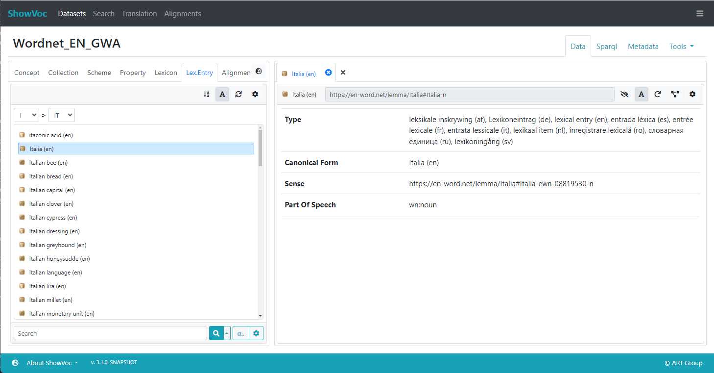
The subdivision of the lexical entries by first letter (or first and second in case of 2-char index) is similar to the organization of alphabetically indexed printed dictionaries. It should help the user navigate a potentially long list of lexical entries. Additionally, the user can find a lexical entry through the search field on the bottom of the structure: the selection of a result causes the automatic switch to the right letter of the alphabet.
The alphabetic indexing is also meant to reduce the number of lexical entries that should be retrieved and then displayed in the UI: this optimization can be very important when working with large lexicons. In some circumstances, a single alphabetic index may not sufficient, because the number of matching entries is too high. The gear button above the list can be clicked to reveal a dialog that allows to customize the view.
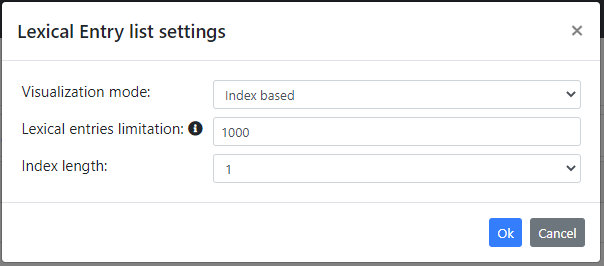
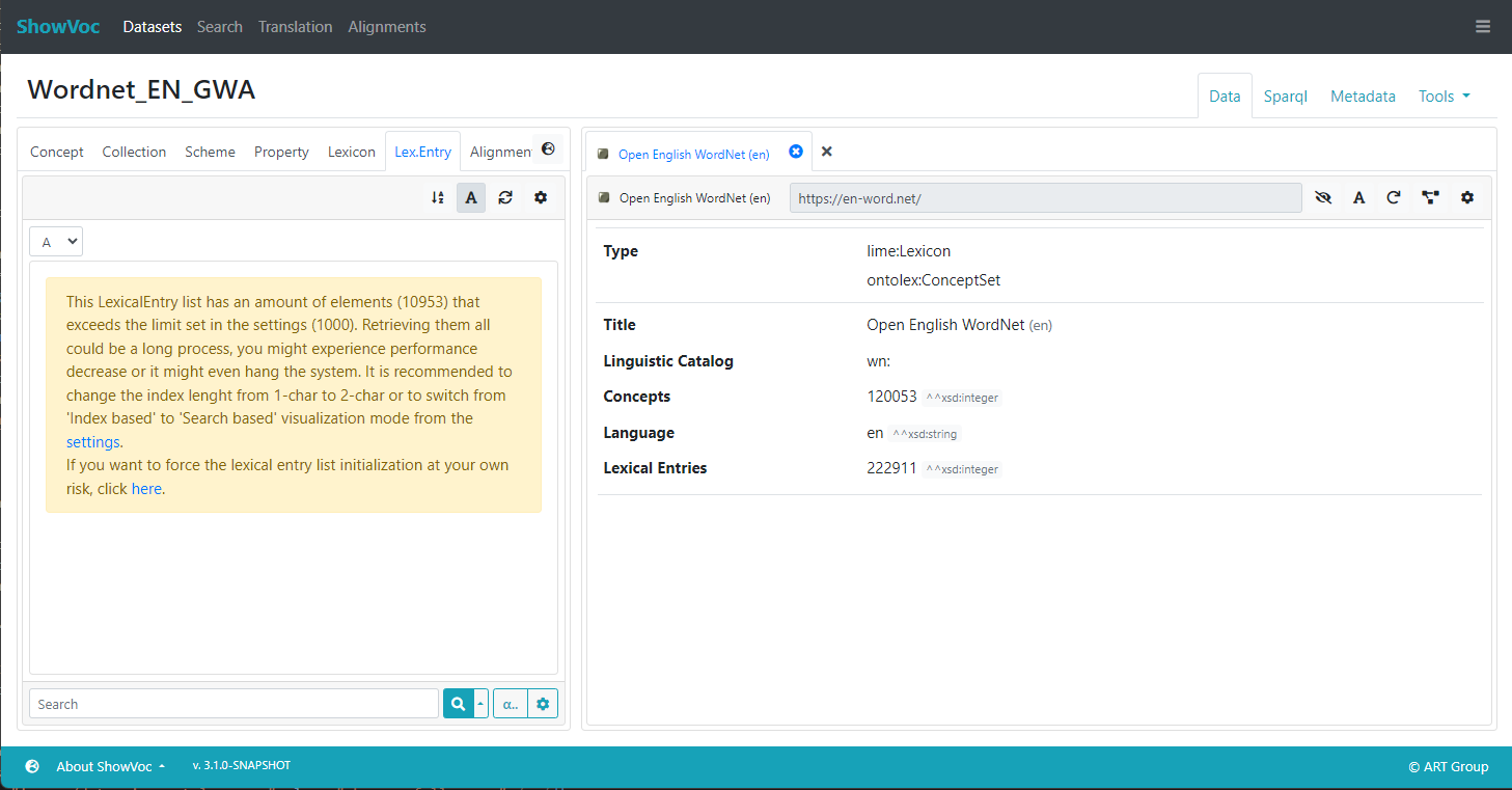
In particular, it is possible to switch between the Index based and the Search based visualization modes. The former is enabled by default, and it can be configured by choosing between using just one or two letters as index. A longer index has be shown to be adequate for browsing very large lexicons such as the Open Multilingual Wordnet. The "search based" visualization mode offers an alternative in which the list is only populated with the results of a search.
A mechanism for preventing the initialization of too much element has been provided. Through the Lexical entries limitation is indeed possible to warn the user when its index selection is not so restrictive and the amount of lexical entries retrieved could lead to performance issues. In case of such limit is exceeded, the list initialization is blocked and a warning message appears in the panel suggesting possible solutions.
Alignment View
In the Alignment tab it is possible to see the datasets for which exist semantic relations with the resources of the current one.
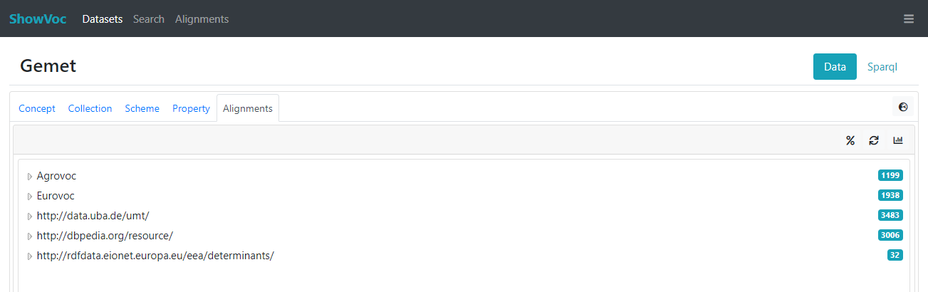
Every element of the list is rendered by a user-friendly dataset name (in case the related dataset is hosted and profiled in ShowVoc) or by a URI space. On the right of them a number tells the amount of linksets available for that dataset, namely the amount of resources defined in the current dataset that are mapped (linked through a semantic relation) to resources defined in that target dataset. For example, looking at the image above, we can tell that Gemet has 1199 resources related to Agrovoc resources, 1938 with Eurovoc resources and so on. The elements of the list can be in turn expanded in order to see their alignments.
Note: due to a current limitation, it is not possible to know a-priori if a dataset has in turn alignments with other datasets. So, each dataset is rendered as “expandable”, namely with a triangle on its left. Only after it is expanded, in case no alignment is found, it will be rendered as no expandable and the triangle disappears.
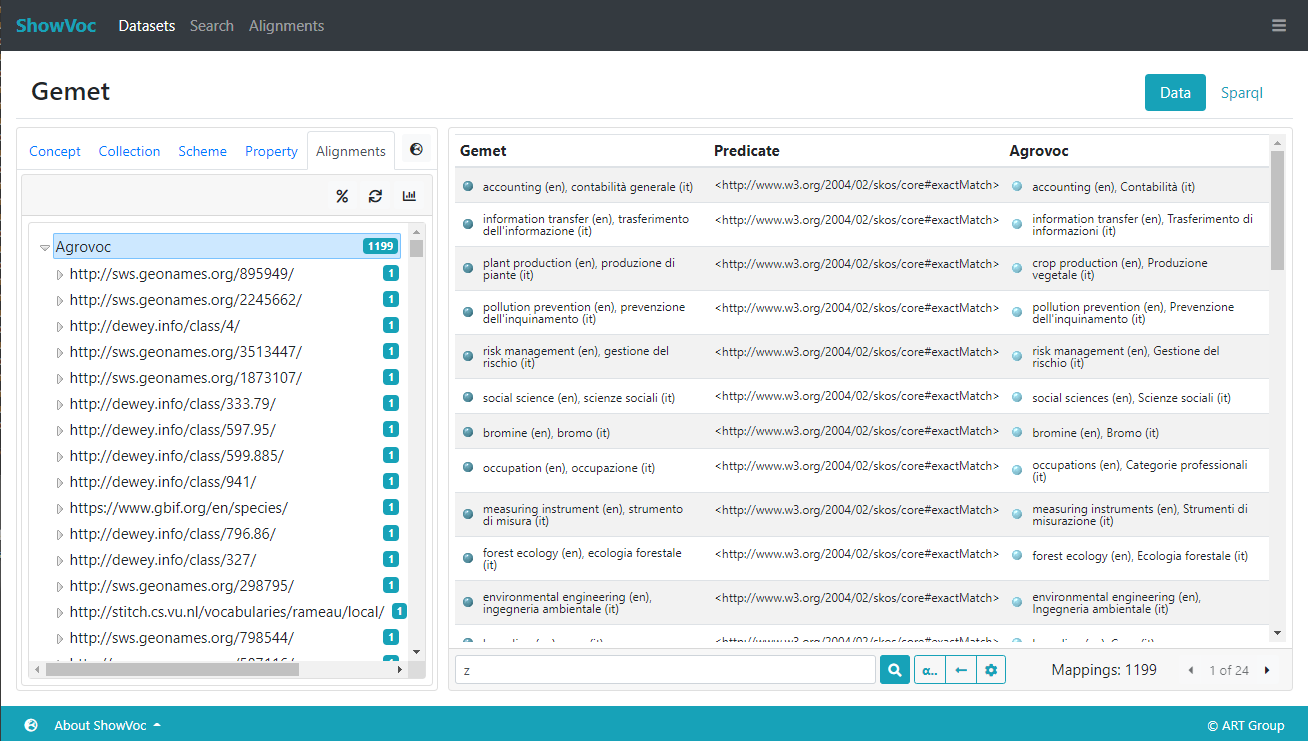
When a dataset is selected a panel opens on the right of the Alignments tab where the actual alignments are shown. More details about this panel can be found in the dedicated page (where it is explained, among other things, how to perform a search on the alignment resources or how to export such list of alignments).
The Resource View
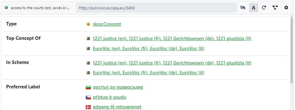
The ResourceView is a general widget for showing the details of different kind of resources. Each time you click a resource in the left pane, its ResourceView opens in the active tab on the right. To open a ResourceView in a new tab, press the Ctrl key (or Command on MacOs). Double-click on a resource displayed as value in the active Resource View opens its description in the same active tab. The next figure shows an example with two tabs.
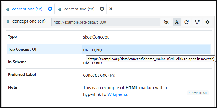
Double-clicking on any resource will display this resource in the active tab (or with Ctrl+click in a new tab). Even resources that appear as values in a ResourceView (like the concept scheme "main" in the example above) can be inspected with a double-click. A click on a hyperlink (like "Wikipedia" in the Note above) will open the link in a browser.
If you click a resource that is not reachable in any tree or list, its ResourceView will open in a modal dialog as shown in the figure below.
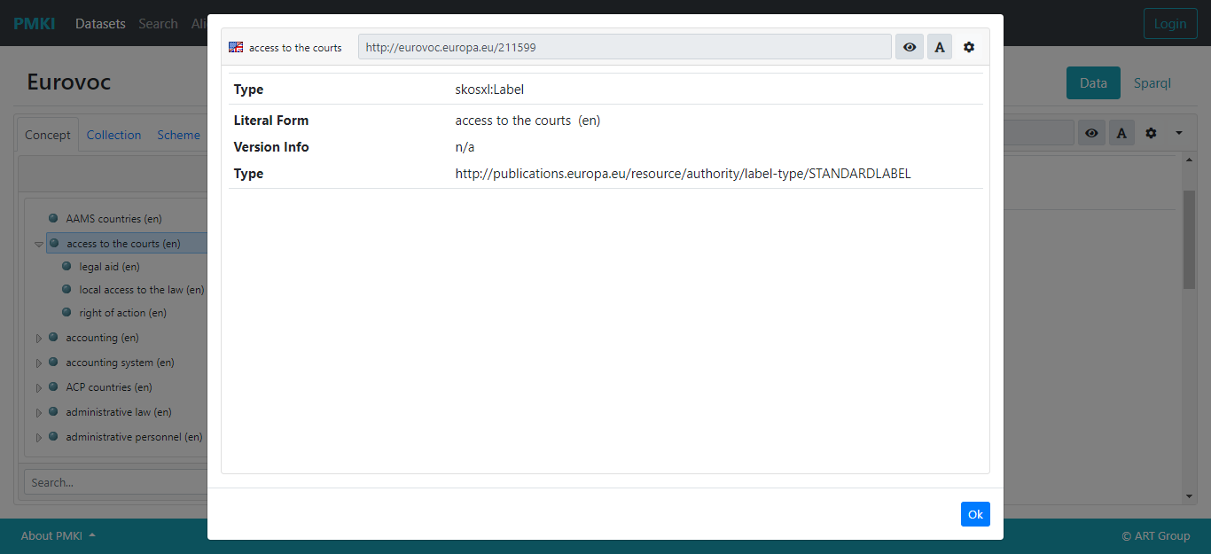
At the top of the ResourceView there is a bar with three buttons on it: the button with the eye allows to enable or disable the inferred information; the button with the capital A enables/disables the rendering; it is followed by the Refresh button. The next button allows to display the current resource in a graph view, which will be described later. Finally, the button with the cog icon allows to edit the ResourceView settings.

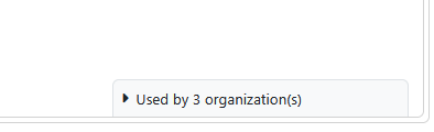
Used by
If the "Enable Digital Objects Annotation" is checked (in configuration) then, in the lower-right part of the window you will see a "Used by N organization(s)" element, where "N" is a number (you will see this element only if there is at least one Annotation of Digital Object associated to the current Resource)
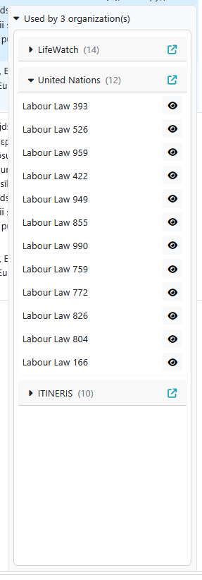
If you click on the "Used by N organization(s)" you see the list of Annotations of Digital Objects associated to the current resources (group by the organizations) and if you click on any of these organization you can see the list of single Annotations of Digital Objects (similar to what is done and explained in the metadata page).
Resource View Settings
In the ResourceView settings dialog it is possible to apply various customizations to the view.
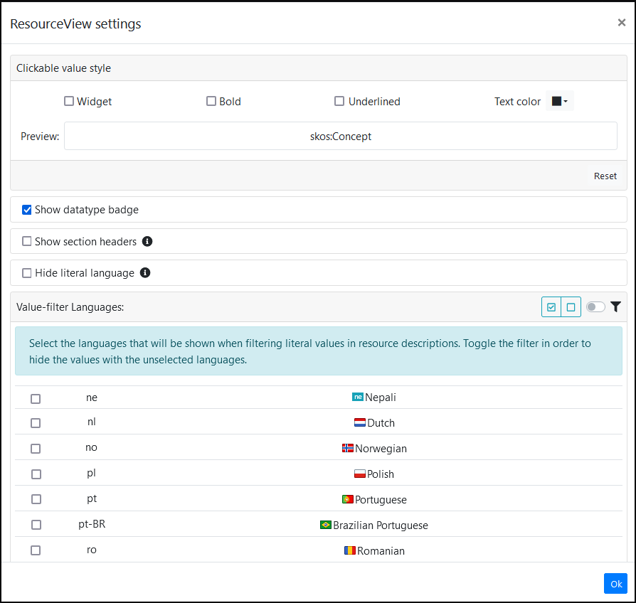
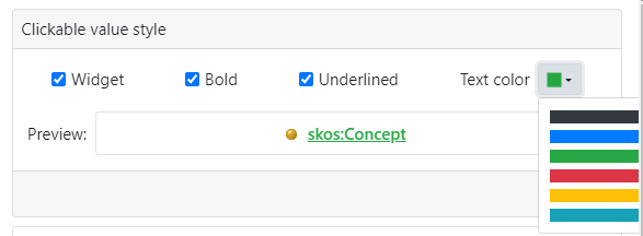
In the section Clickable value style users can customize the way clickable values (resources that can be described in turn) are shown. For example, they can be displayed using a special widget with an icon/flag on the left, or using a custom color, or setting the text style to bold and/or underlined. The following images show an example of a custom style setting and the resulting presentation.
Below the Clickable value style section, there are three other options:
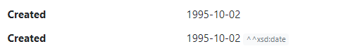
- Show datatype badge: indicates whether typed literals should be accompanied by a badge that explicitly states the datatype. The following image shows the same date with the option disabled/enabled.
- Show section headers: if enabled, a header is displayed for each section in the ResourceView (see example at the end of this section).
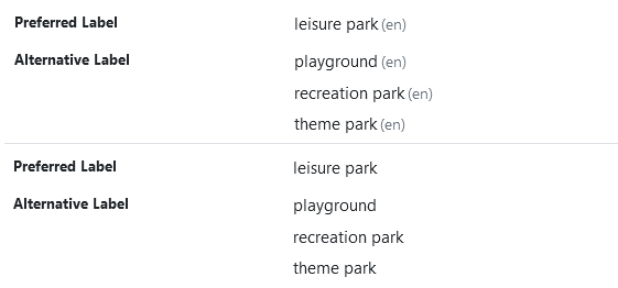
- Hide literal language: if enabled, the language code of literal values will not be displayed. The following images show the same labels with the option disabled/enabled.
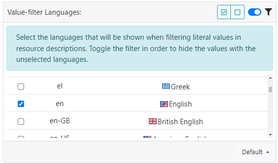
Within the Value-filter Languages panel, it is possible to select the languages that will be shown when filtering literal values in resource descriptions. For example, if the user wants to see only the English labels of a resource, it is enough to check only the en language and activate the filter with the switch in the top right corner.
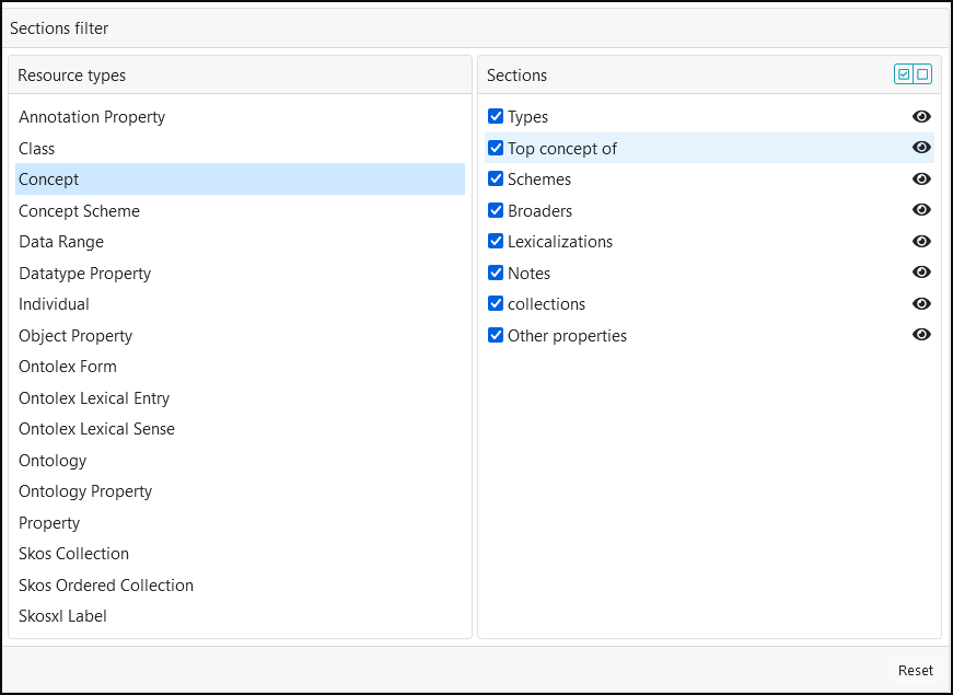
The Section Filter panel enables users to hide any partitions of the ResourceView that are not of interest to them. The panel is divided into two sub-panels. The left-hand panel lists all available resource types (e.g., Concept, Class, etc.). Users can check or uncheck a specific partition for each resource type to show or hide it from the view. Additionally, the Section panel offers quick actions to make visible or hidden all sections for a given resource type.
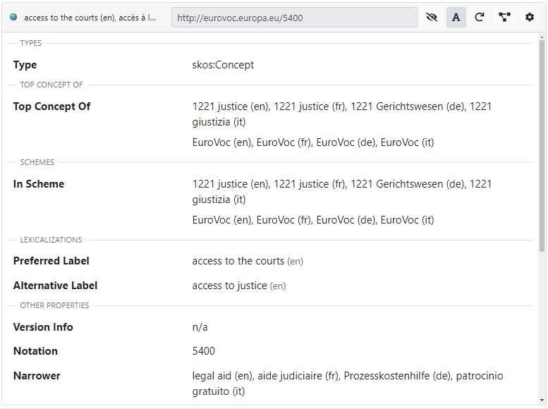
By default, the ResourceView does not explicitly show section divisions. This can be modified by enabling the "Show section headers" option mentioned above. When this option is enabled, the names of the sections are visible in the ResourceView, as in the following example.
Further customization of the Resource View can be managed in the Dataset Settings editor documented here.
Search
Navigation in tree and list panels is supported by a search bar for finding resources in the dataset.
The Search Bar
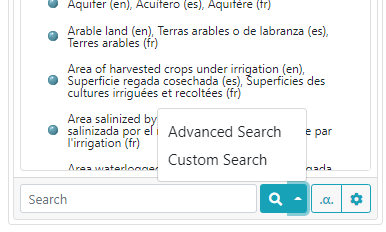
The search bar provides three different search modes
- Standard search: a "simple" search that looks for a prompted string
- Advanced search: a more powerful search which allows to apply filters
- Custom search: a search based on parameterized SPARQL queries
The standard search is the default search fired when the "lens" symbol is clicked or the ENTER key is pressed during the typing into the search bar input field.
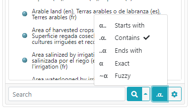
Besides the search button, a quick option button allows to choose the strategy for search, among:
- Exact: looks for resource having an exact match with the prompted string
- Contains: looks for resource having at least a lexicalization containing the prompted string
- Starts with: looks for resource having at least a lexicalization starting with the prompted string
- Ends with: looks for resource having at least a lexicalization ending with the prompted string
- Fuzzy: looks for resource having an approximate match with the prompted string
- Search syntax: uses Lucene syntax to perform complex searchs (see Lucene 10.2.2 queryparser API to learn its syntax and see some examples). Only available on projects using GraphDB
The gear button on the Search bar opens a further set of options:
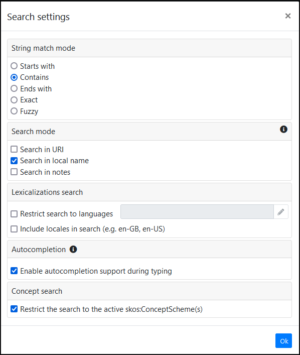
The following options are available:
- The first option (String match mode) is related again to the search strategy, also available as a quick option on the bar.
- Search mode: Options to extend the search (which normally acts only on lexicalizations) to search the entire URI, the local name of the resource, and eventual notes.
- Lexicalizations search: Options to limit the search to one or more specific language(s).
- Autocompletion: Enables auto-completion of the search string as it is typed, looking at all available lexicalizations (and local names if included in the search).
- Concept search (available only in concept panel): through an option contained in this section it is possible to constrain the search to only the currently active skos:ConceptScheme(s).
Advanced Search
The advanced search is a powerful search tool that allows to search resources in the dataset with the support of a set of more complex filters than the ones of the standard search. Unlike the standard, this search looks for any resource in the dataset, so it is not constrained to the kind of resource shown by the panel where the search is executed/invoked.
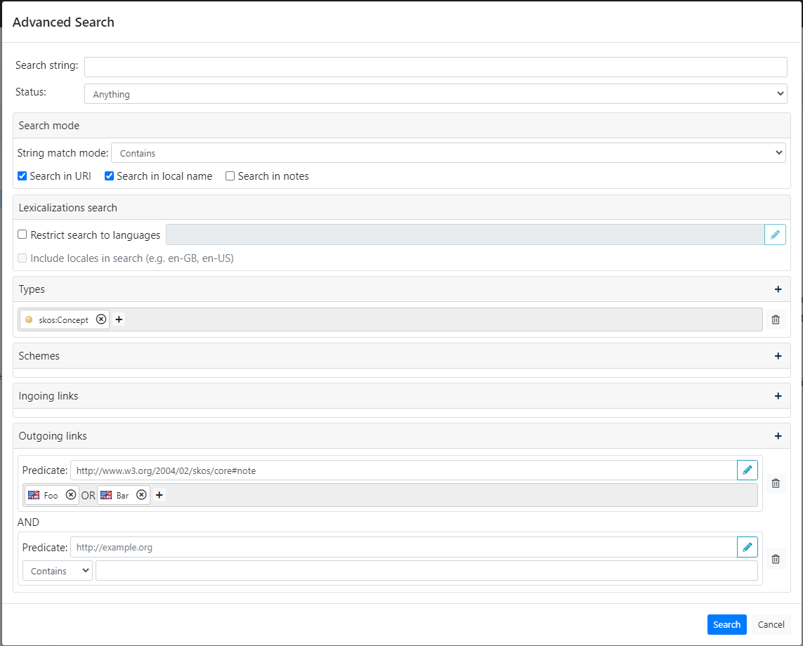
It foreseen the following filters:
- Search string: it is optional, if provided, similarly to the standard search, this string is used to search a resource according the criteria specified in the Search mode section.
- Status: allows to search resources by status. Available statuses are Anything, Not deprecated and Only deprecated.
- Search mode: see the description in the previous section.
- Lexicalization: see the description in the previous section.
- Types: if provided, filters the results to the resources belonging to the given class. Multiple classes are evaluated in AND
- Schemes: similarly to the Types, filters the results to the resources belonging to the given scheme (only in projects where the concept tree is available). Multiple schemes are evaluated in AND.
- Ingoing links: filters the results according to subject-predicate pairs. Multiple pairs are evaluated in AND, multiple subjects in OR.
- Outgoing links: filters the results according to predicate-object pairs. Multiple pairs are evaluated in AND, multiple objects in OR. The object could be a set of values, or a plain literal that is in turn retrieved through a free-text search.
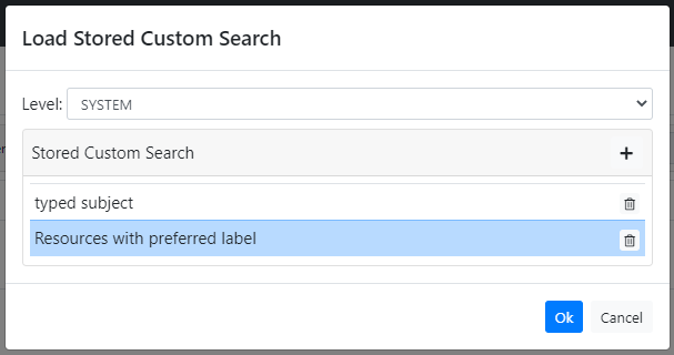
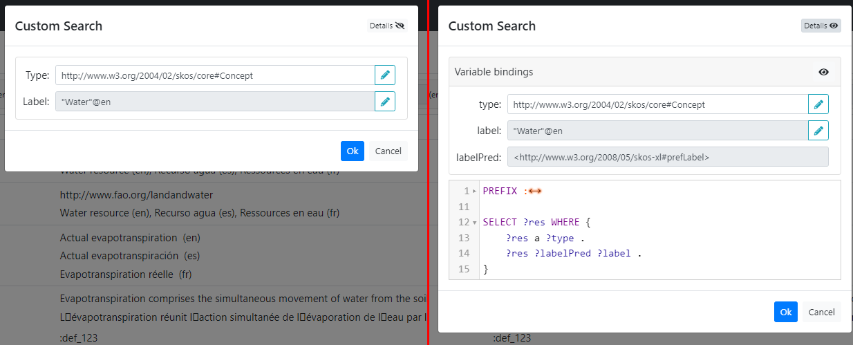
Custom Search
The custom search exploits the power of SPARQL to execute customizable search. A custom search can be instantiated selecting a previously stored parameterized query which must return a single variable (if not, an error will be displayed when running the search).
The UI shows a form composed by as many input fields as parameters defined by the parameterized query. Each input field guides the user to enter a value that is compliant with the constraints defined by the related parameterized SPARQL query. For instance, in the example shown in the following figure, the Type field suggests to enter a class, Label Pred. a property and Label a string or a plain literal.
Enabling the details (by clicking on the Details button in the top right corner) the UI shows the varible names (instead of a display name) beside each fields and also the SPARQL query related to the custom search.
Graph View
In addition to the Data Structure Views (trees, lists and ResourceView), it is possible to explore the data through the Graph View.
ShowVoc provides three kinds of Graph View:
- Data-oriented: it is a close representation of the RDF graph, with nodes representing resources and edges representing properties.
- Model-oriented: it is oriented to the relations that describe the ontology model, like the relations between the domain and range classes of a property.
- Class-diagram: an UML-like class-diagram that describes relations between classes and their properties.
For further details, see the dedicated page.